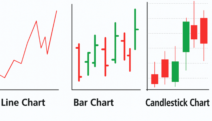
Charts are the backbone and among the most crucial tools in forex trading. They provide a visual representation of price movements over time, making it easier for traders to identify patterns, trends, and trading opportunities.
There are three main types of forex charts: Line Charts, Bar Charts, and Candlestick Charts.
Each has its strengths and weaknesses, and knowing how to read them is essential for your trading journey.
In the following lessons, we’ll break down each chart type in detail.
Lesson 6.1: Line Chart
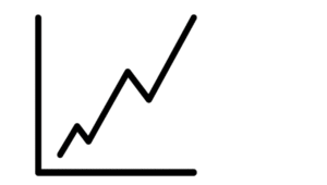
A line chart is the simplest type of chart used in the foreign exchange (forex) market.
- It connects closing prices over a selected time frame with a continuous line.
- It helps traders quickly see the general direction of a currency pair.
- Helpful in identifying trends, but it lacks detailed information about highs, lows, and price fluctuations within a period.
Example: A line chart of EUR/USD may show a steady upward trend, but it won’t reveal how volatile the market was within each time period.
Lesson 6.2: Bar Chart
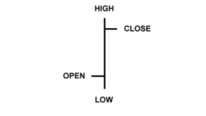
A bar chart provides more detail than a line chart.
- Each bar shows the opening, high, low, and closing prices (OHLC) for each time period.
- The vertical line represents the trading range (high to low).
- A horizontal dash on the left shows the opening price, and one on the right shows the closing price.
- Traders use bar charts to see volatility and intraday price action.
Key Point: The top of the vertical line represents the highest price, while the bottom represents the lowest. Small horizontal dashes indicate opening (left) and closing (right) prices.
Lesson 6.3: Candlestick Chart
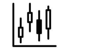
Candlestick charts are the most popular among forex traders.
- Each candlestick shows the opening, closing, high, and low prices for a given period.
- The “body” represents the open-to-close range, while the “wicks” (or shadows) show the highs and lows.
- Bullish candles (price up) are usually green or white, while bearish candles (price down) are red or black.
- They provide the same information as bar charts but are visually easier to interpret.
Example: A long green candlestick suggests strong buying pressure.
Which Chart is Best?
- Line Chart: Best for a quick overview.
- Bar Chart: Best for more detail and shows OHLC.
- Candlestick Chart: Best for pattern recognition, analysis, and trading signals.
👉 Most Forex traders rely heavily on candlestick charts.
Understanding these three chart types is key to interpreting price movements and developing your own trading strategy.